


- What is our revenue compared to our expenses?
- How many subscribers do we have? Also, how many customers are we losing?
- How many customers are using fixed lines versus cellular lines?
- Which services are customers using most heavily?
This information is crucial because it not only offers insight into the company’s financial health and subscriber numbers but also helps the viewer analyze where their network is most heavily taxed. With this data, the company can ensure that they are using resources efficiently in order to keep up with subscriber demand.
Track Revenue, Expenses, and Customer Churn Rate
For example, with the “Total Subscribers,” “Total Revenue,” “Total Expense,” and “Churn Rate” widgets, we can see an overview of the company’s financial status. Further, with the “Average Revenue per User by Plan” widget, we can not only see how much revenue is earned per customer but also access a detailed breakdown of revenue sources (data, text, and voice). This widget utilizes the multi-level drill down function. This means that clicking any of the dots on the widget will allow us to view more information. For example, if I click on October 2018’s dot, I can see that, on average, the company earned $204 in data fees, $38 in text messaging fees, and $157 in voice fees from each user.
Review Phone Plan Details
The “Subscriber Segmentation by Service Type” and “Total Subscribers per Service Type by Quarter” widgets supply useful data regarding the number of customers using fixed lines versus postpaid or prepaid mobile devices. The widget that tracks quarterly use is particularly useful for evaluating subscription trends that may occur over time; for example, we can see that prepaid sales dropped from Q1 to Q2 2018, stabilized for a few quarters, then dropped again in Q1 2019.
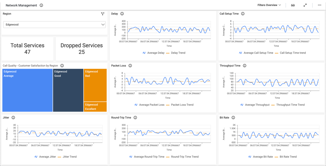
Assess Network Use
Finally, the service and network utilization widgets offer insight into customers’ use. With the “Text, Voice & Data Service Utilization by Quarter” widget, viewers can track quarterly trends that may be occurring, and the “Network Utilization by Subscribers per Month” widget details how much of the network is used by each category of subscribers. Knowing which customers use the network most heavily could help the company ensure that they are able to meet customers’ needs and that each subscription plan is appropriately priced.